|
|
Post by Crix on Sept 25, 2011 15:25:58 GMT -5
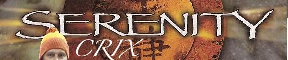
after going to Detroit Fanfair, I thought, wouldnt it be great if I had some cards to give out, so people in ff/s costumes would be able to check us out after the con. and it would of been nice to give one to Adam Baldwin.. I slapped this together for now. printed some from my computer, but only got bout 10 before I ran out of ink.  I think before the next con I go to, I'll get them made Professionally. I did this with "paint". My computer wont run Photoshop. so if anyone has better ideas, I would like to see them. it must have the name - "The 'Verse" the forum Website - theverse.proboards.com/index.cgiyou can put the Facebook page on it too  |
|
|
|
Post by Crix on Oct 11, 2011 15:47:15 GMT -5
well I order 250 of these... with shipping, just over $10. I am not %100 happy with this design, so I only ordered the smallest amount.. and cheapest way to print em, nothing fancy just enough to get me by for a few Cons next year. anyone want some to give out, let me know.. I can send some to you.. 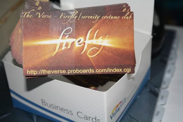 |
|
|
|
Post by BrowncoatKal on Oct 15, 2011 21:06:52 GMT -5
Why are you not happy with the design? I like the general layout you created. It's simple, to the point, and easily recognizable by Browncoats everywhere. I went ahead and tweaked it a little. I think that Serenity should be capitalized and in the papyrus font. Also, you don't need to add the "/index.cgi" to the end of the web address. Leaving that off makes the address easier to remember. The main font I used, separate from Firefly, Serenity, and Blue Sun, is a font called Bleeding Cowboy. It is a western font that I like. And then of course I wanted to put a little Blue Sun logo on it because Blue Sun is on practically everything in the 'verse. By the way, the Blue Sun font is a font called Bionic Kid. It was used multiple places in the movie Serenity. I have two versions for your perusal. Let me know what you think...   |
|
|
|
Post by Destiny Froste on Oct 16, 2011 23:29:39 GMT -5
I agree with you making Serenity capitalized, and I understand why you made the f on firefly lowercase (although it looks a bit funny to me, but I would definitely also cap the V in Verse.
|
|
|
|
Post by Crix on Oct 17, 2011 11:50:05 GMT -5
very cool.. I didnt catch the capitalize S for serenity.. doh!
I love the BLUE SUN logo on it. very cool idea. diffenitly got to have that on it!
I didnt know about "/index.cgi" too, thank you.. I just copied it for mine..
I am not sure if I am sold on the "Bleeding Cowboy" font. I dont like how the "t" come up to a circle.
I love the "firefly/serenity" fonts, perfect.
the V in verse capitalize, I think would look better.
I really like the bottom one.
great work Steve, mine where just too plain. the few extras you added really make it!
|
|
|
|
Post by BrowncoatKal on Oct 18, 2011 21:04:40 GMT -5
How about these two?   Initially I really liked the first font and found it simple, easy to read and not very common (something I was looking for as I didn't want to have something like Arial or Times New Roman). But then I saw that there wasn't any delineation between capital and lower case letters. I Then stumbled across the font used on the bottom card and fell in love with it. It is the font used by the former Pan American World Airways and I love it. It's bold, easy to read and has a little flair that sets it apart from other fonts. What do you think? |
|
|
|
Post by BrowncoatKal on Oct 18, 2011 23:46:28 GMT -5
Here is one that is almost identical to the one with the Pan Am font, the difference being the capital "F" in Firefly.  |
|
|
|
Post by Crix on Oct 19, 2011 11:06:41 GMT -5
I like this one the best. the lower case f in firefly looks nicer IMO the blue sun symbols are awesome! I REALLY like how you added those! |
|
|
|
Post by Crix on Jan 23, 2012 14:58:03 GMT -5
I tried to order 250 more, cause of the deal "vistaprint" has. 250 for $10 some of lettering crossed into the boarder that they give you. so I added my own boarder to bring in the letters. I could of just started over and brought everything in, but I wasnt thinking at the time ;D also this time I went with a glossy card. The ones I have now are non glossy. Cheapest ones I could get. It was a little over $10 then. I also added the website to the back and "WE AIM TO MISBEHAVE" its too late now, but I am having second thoughts about that last part. I dont want people to think we are just trying to cause trouble... I dont know maybe I am over thinking it. If you are a firefly fan, you know what it means. right? we will see how these come out. ended up being a little over $21, because of glossy and printing on the back. 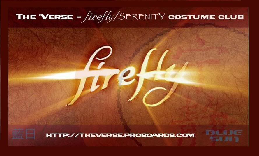 |
|
|
|
Post by Crix on Feb 3, 2012 14:34:31 GMT -5
got the new cards today.... 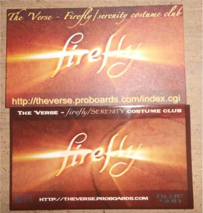 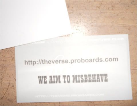 the old one on top, new one on bottom. they look nice, but you can't really see the "blue sun" symbols  you can see them here, I think cause the flash on camra, but you can barely see them in person I tried to take one without the flash, and in my hand so you can see how small the writing is... 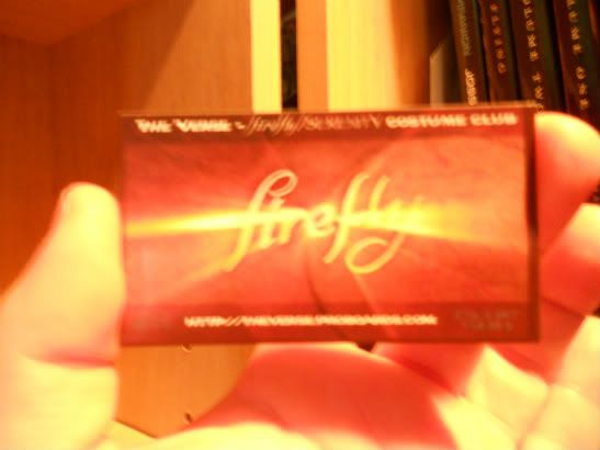 the web site address is a little too small in my opinion, but its nice and big on the back. so that kinda worked out. I did have to shrink the wording a bit to begin with, because some of it fell into their safety margin. so I had to bring it in. Overall, I am more happy with these than the old ones, but still I think we can make it better. the "blue sun" has to be darker and maybe moved to another area so the web address can be bigger, but it is on the back so I dont know if we need too... what do you guys think? and what about the "We aim to misbehave"? Keep it for next batch or not? |
|
|
|
Post by BrowncoatKal on Feb 3, 2012 16:39:31 GMT -5
My original intent with the BLue Sun logo was to make it faint so that it wasn't immediately visible. Then after looking closer at the card it would be like "POW!", oh that's cool. But I could remove them to make the website larger and easier to read, but we could still use the logo. How about something like this? 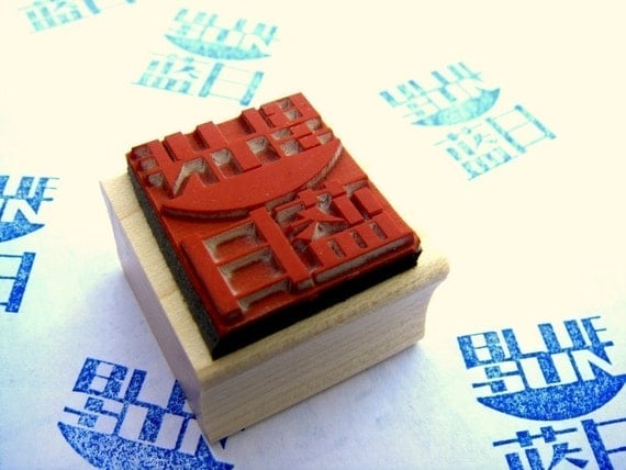 Ma Cobb sells these on her site. What if you got a blue ink pad and hand stamped the back of each card? It would look pretty cool in my opinion, and you might still be able to read any text you had printed there. Here is the link to the Ma Cobb's stamps: www.etsy.com/listing/62111879/blue-sun-rubber-stamp |
|
|
|
Post by BrowncoatKal on Feb 3, 2012 16:47:14 GMT -5
|
|
|
|
Post by Crix on Feb 3, 2012 19:39:51 GMT -5
that's a good idea for the back. I know what you mean on the Blue sun logo being faint.. I liked that idea too but the pictures I have here don't come close to the real thing. it shows up for the camera, but not in person...but I don't know, it could be just me  my eye sight is not the best. I can send you some if you like so you can get a real look at them. its not quit the same in the pictures.. |
|
|
|
Post by Crix on Feb 3, 2012 22:04:23 GMT -5
you know what... the more I look at this new one, the more I am liking it.
in hand, you can barely see the "blue sun" logo , but I am thinking you are right about not seeing it... but when you do, BAM!
I didn't really think of it that way.
and as far as the Web address, its on the back in big letters, so that works..
what do you think about the "we aim to misbehave" keep it or lose it if I ever order a new batch?
|
|
|
|
Post by BrowncoatKal on Feb 4, 2012 2:09:06 GMT -5
Here's a slight redesign I did. I enlarged the font on the web address at the bottom of the card. Also I added a thin black border around all of the text on the front of the card. I think it helps to make the letters pop off the front of the card. And, like you, I gave the card a border for printing purposes. I chose black because I think it offsets the rest of the card nicely. As for the back, if we can get the web address nice and readable on the front of the card, I'm not sure we need to have it on there twice. I do like the idea of a slogan. We aim to misbehave[i/] is nice, but how about We've done the impossible and that makes us mighty[i/]? I think having a slogan or motto on the back would be nice, and if it was there by itself without the web address, I think it would be cooler and stand out more.
 |
|


 my eye sight is not the best.